HTML and CSS Reference
In-Depth Information
p:nth-of-type(2) {
flex: 2 1 0;
}
The first style rule sets the flex grow and flex shrink ratios for all paragraphs to
1
, and the
flex-basis
component to
0
. The second rule resets the flex grow ratio for the second paragraph to
2
.
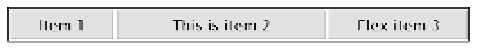
As Figure
22-22
shows, the free space in the flex container is distributed to each paragraph by applying the
flex grow ratio to the paragraph's full width. The second paragraph is twice as wide as the other two.
1×
2×
1×
Figure 22-22.
The free space is distributed to each paragraph in direct proportion to its flex grow ratio
How auto flex-basis Distributes Space
In flex-basis_auto.html the final value in the
flex
properties has been set to
auto
like this:
p {
margin: 2px;
padding: 5px 0;
text-align: center;
background-color: #CCC;
border: 1px solid #999;
font-family: "Lucida Sans Unicode", "Lucida Grande", sans-serif;
flex: 1 1
auto
;
}
p:nth-of-type(2) {
flex: 2 1
auto
;
}
The browser sets the width of each paragraph based on its content, and then distributes any space that's left
over to each one in proportion to the flex grow ratio, as shown in Figure
22-23
.
1×
1×
2×
2×
1×
1×
Figure 22-23.
Only the extra space is distributed when the flex-basis component is set to auto
Even though the same flex grow ratio is applied to the first and third paragraphs, the third one is much wider
because it contains more text.
■
Note
Flex items won't shrink below the size of the longest word or fixed-size element.