HTML and CSS Reference
In-Depth Information
article>figure {
order: -1;
margin-top: 0;
margin-bottom: 0;
}
article>h3 {
order: -2;
margin-top: 0;
}
The
order
property is not set for the other items, so they all have the default value
0
. As a result, they're
displayed in their source order after the heading and image have been relocated.
■
The final order in which items are displayed is determined by the direction of the flow inside the flex
container, as the following example demonstrates.
Caution
It's important to realize that using
order
to move an item to the top of the display list doesn't override the
effect of
flex-direction
,
flex-wrap
, or
flex-flow
. In order_row-reverse.html, the following style rule moves the
second paragraph to the top of the display list:
p:nth-of-type(2) {
order: -1;
}
However, the main axis is reversed by this rule:
#container {
display: flex;
flex-flow: row-reverse wrap;
border: 1px solid #000;
width: 400px;
}
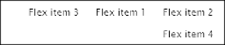
As Figure
22-20
shows,
Flex item 2
is displayed at the top-right of the flex container because reversing
the main axis changes the main-start to the right edge. In other words, it has become the first item within the
container's reversed flow.
Figure 22-20.
The order of items is subject to the direction of the container's axes
Controlling the Dimensions of Flex Items
According to the Flexible Box Layout module, the “defining aspect of flex layout is the ability to make flex
items
flex
, altering their width or height to fill the available space.” This is achieved with the properties listed in
Table
22-2
. There are three independent properties and a shorthand one. However, the shorthand one is listed
first because it's recommended to use it in preference to the individual ones.