HTML and CSS Reference
In-Depth Information
Figure 22-14.
The column items are displayed in reverse order
Figure
22-15
shows what happens in a multiple-column container when the main axis is reversed like this
(the code is in column-reverse_wrap.html):
#container {
display: flex;
flex-direction: column-reverse;
flex-wrap: wrap;
border: 1px solid #000;
width: 400px;
height: 120px;
}
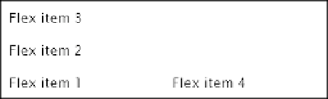
Figure 22-15.
The new column begins at the bottom of the container when the main axis is reversed
Notice that the new column begins at the bottom of the flex container. This is because reversing the main
axis changes not only the display order, but also the main-start and main-end edges.
The same effect is achieved by the following shorthand:
flex-flow: column-reverse wrap;
■
Although it might not be immediately obvious, the browser doesn't reorder the flex items and then lay them
out. It actually does reverse the axis along which they're displayed. That's why
Flex item 4
overflows to the left in
Figure
22-12
, and ends up in the next row or column in Figures
22-13
and
22-15
.
Tip
Reversing the Cross Axis
Setting the
flex-wrap
property to
wrap-reverse
not only allows the flex container to display multiple rows or
columns, but it also reverses the cross axis. Let's see what effect that has when the main axis runs in the
normal direction.