HTML and CSS Reference
In-Depth Information
Instead of using the individual properties, you can combine them in the shorthand
flex-flow
property
like this:
flex-flow: column wrap;
Not
■
You cannot specify the number of rows or columns for a multi-line flex container. The choice is limited to
single-line or multi-line.
In most cases, the options described in the preceding sections are likely to be all you need: single or multiple
rows or columns with the flex items displayed in the order they appear in the underlying HTML. However, the
flex-direction
and
flex-wrap
properties (and the
flex-flow
shorthand) let you manipulate the direction
of the main and cross axes, either independently or at the same time. The next three sections describe what
happens in each combination.
Reversing the Main Axis
The
flex-direction
property lets you reverse the direction of the main axis. The styles in row-reverse.html
reverse the direction of a single-row flex container like this:
#container {
display: flex;
flex-direction: row-reverse;
border: 1px solid #000;
width: 400px;
}
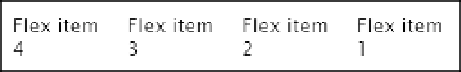
The underlying HTML is still in the same order as Listing 22-2, but the flex items are displayed from right to
left, as shown in Figure
22-11
.
Figure 22-11.
The flex items are displayed in reverse order
The same effect is achieved by setting the shorthand
flex-flow
to
row-reverse
.
You need to be careful when reversing the main axis of a single-row flex container. Figure
22-12
shows what
happens when the paragraphs are given a minimum width of
100px
(the code is in row-reverse_nowrap.html).
The overflow disappears off the left of the browser viewport without spawning a scrollbar.