HTML and CSS Reference
In-Depth Information
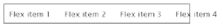
In row_nowrap.html, the paragraphs have been given a minimum width of
100px
. Because they also have a
10px
margin all round, they're too wide to fit into the flex container. As Figure
22-7
shows, they spill out.
Figure 22-7.
If the flex items are too wide for the container they spill out rather than wrap to another row
Although you can set the
overflow
property (see “Handling Content That's Too Big” in Chapter 6) on the flex
container, the normal way to deal with overflow is to make the container capable of handling multiple rows, as
described later in this chapter.
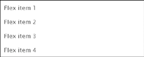
Single Column
To display the contents of a flex container in a single column, you need to set
flex-direction
to
column
as in
column.html like this:
#container {
display: flex;
flex-direction: column;
border: 1px solid #000;
width: 400px;
}
Alternatively, you can set
flex-flow
to
column
like this:
#container {
display: flex;
flex-flow: column;
border: 1px solid #000;
width: 400px;
}
This creates a single column with the flex items displayed in the same order as the underlying source code,
as shown in Figure
22-8
.
Figure 22-8.
Setting flex-direction or flex-flow to column creates a single-column layout