HTML and CSS Reference
In-Depth Information
Cross-end:
The side where the cross axis ends.
Cross size:
The size of a flex item or container measured along the cross axis. In a row,
it's the item's height. In a column, it's the item's width.
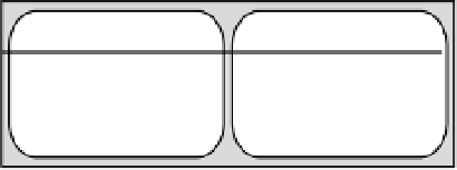
Main-start
Main-end
Cross-start
Main axis
Cross size
Cross-end
Main size
Figure 22-5.
The main parts and dimensions of a flex container
■
Note
In traditional Chinese and Japanese layout, rows run vertically, and columns run from right to left.
Creating a Flex Container
The Flexible Box Layout module adds two new values for the
display
property:
flex
The element becomes a block-level flex container.
inline-flex
The element becomes an inline flex container.
The difference between these two values lies in how the element interacts with surrounding elements. In the
overwhelming majority of cases,
flex
is the value you'll need. Using
inline-flex
creates a flex container that is
displayed inline in a similar way to setting
display
to
inline-block
(see “Understanding the Difference Between
inline and inline-block” in Chapter 6).
■
Because
display
is a standard property, browser-specific prefixes are added to the value rather than the
property. For example, the source files use
display: -webkit-flex
to create a flex container in Chrome 21.
Note
A flex container establishes a
flex formatting context
for all its contents. This has the following consequences:
•
All child elements automatically become flex items.
•
Floats do not intrude into the flex container.
•
Adjacent vertical margins on flex items are not merged.
•
You cannot use multi-column layout (see Chapter
18) inside a flex container.
float
,
clear
, and
vertical-align
properties have no effect on flex items.
•
The