HTML and CSS Reference
In-Depth Information
Figure 17-10.
The images are no longer floated
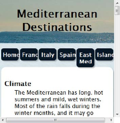
11. Scroll up to the top of the page, and resize the browser window to simulate what
the page might look like on a mobile phone. As Figure
17-11
shows, the navigation
menu not only looks bad, but it's also likely to be unusably small on a touch screen.
The background image for the header looks OK, but without the yachts, it has lost
visual interest. Also, there's a big gap above the “Climate” heading.
Figure 17-11.
The top of the page looks a mess at a narrow width