HTML and CSS Reference
In-Depth Information
The shapes in Figure
15-12
were created by styling empty
<div>
elements with the following styles in
triangles.html:
#borders, #right {
margin: 20px;
float: left;
height: 0;
width: 0;
border-style: solid;
border-width: 50px;
border-color: green orange blue red;
}
#right {
border-color: transparent transparent transparent red;
}
The style rule for the
right <div>
overrides the
border-color
property, setting the top, right, and bottom
borders to
transparent
. As a result, you get a red right-facing triangle.
■
Tip
Creating a Ribbon Effect
A very simple effect that you can create with triangles and the
::before
and
::after
pseudo-elements is a
ribbon that gives a heading a 3D look.
exerCise: simple ribbon effeCt
In this exercise, you'll add triangles at either end of a heading's background using the
::before
and
::after
pseudo-elements and a combination of relative and absolute positioning. Use as your starting point
ribbon_begin.html in the ch15 folder. The finished file is ribbon_end.html.
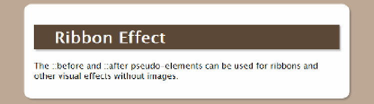
1.
View the page in a browser. The heading has a chocolate background and drop
shadow, but is constrained by the padding in the
wrapper <div>
, as shown in
Figure
15-13
.
Figure 15-13.
The heading's background doesn't extend beyond the padding