HTML and CSS Reference
In-Depth Information
Figure 15-11.
The counters() function automatically generates the subsection numbers
Each nested
<ol>
element creates a new instance of the
nested
counter, which is reset to
0
. The
::before
pseudo-element on each list item increments the counter, and the
counters()
function displays the value not
only for the current level, but also for the preceding ones separated by a dot. The final dot and space are added
as a string at the end of the
content
value.
Creating Fun Visual Effects with Generated Content
One of the most fascinating aspects of working with CSS is the way that properties and selectors can be used
in ways that were almost certainly not envisaged when the specification was first drawn up. The
::before
and
::after
pseudo-elements were originally conceived as being used to generate the type of content described in
the preceding sections. But they're increasingly used to create visual effects such as ribbons and speech bubbles.
■
All the preceding examples work with the CSS2.1 syntax for pseudo-elements (
:before
and
:after
).
However, the visual effects in the rest of this chapter rely on CSS3 features not supported by IE 8. To prevent
problems with IE 8, always use the CSS3 syntax (
::before
and
::after
) with these techniques.
Caution
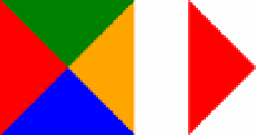
The visual effects are made possible thanks to absolute positioning and the ability to generate shapes using
background colors, borders, and properties such as
border-radius
. For example, you can create triangles by
setting the width and height of an element to
0
, and giving it a wide border. If you give each border a different
color, they intersect as triangles, as shown on the left of Figure
15-12
. Make three of the borders transparent, and
you're left with a triangle as shown on the right.
Figure 15-12.
Wide borders on an element with no width and height can be used to create triangles