HTML and CSS Reference
In-Depth Information
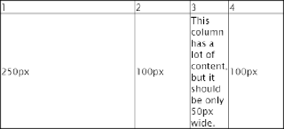
Figure 14-20.
The columns are taking their width from the cells in the first row
4.
Use your browser's developer tools to check the actual width of the third column.
in Safari or Chrome, right-click the column, and select
Inspect Element
from the
context menu. Then select the
<td>
markup for one of the column's cells in the
panel that opens. because the column's width has been set to
10%
and the table
is
500px
wide, it should be
50px
wide. but as Figure
14-21
shows, the column
is actually
68px
wide in Chrome. it might be slightly different in another browser,
but in all browsers, the width of each column has been adjusted automatically to
accommodate the long words in the third column.
Figure 14-21.
The table has automatically adjusted the width to make sure the text fits
5. Amend the
table
style rule to set
table-layout
to
fixed
:
table {
width: 500px;
border-collapse: collapse;
border: 1px solid #000;
table-layout: fixed;
}
6.
Save the page, and test the table again. This time, the third column is exactly
50px
wide, but the longer words protrude into the fourth column (see Figure
14-22
).