HTML and CSS Reference
In-Depth Information
This is a simple and effective way of creating a single row of multiple columns. Just set the
display
property
of the columns to
table-cell
. There is no need to wrap them in a row or table. Other elements stack above or
below the anonymous table.
Wrapping the Header, Footer, and Columns in a Table Row or Table
In the examples using Listing 12-1, using
table-row
on its own didn't work (see Figure
12-12
). So, there's no
reason to expect it to work with Listing 12-2. (It doesn't.) However, what happens when you set the
display
property of the
wrapper<div>
to
table-row
or
table
might come as a surprise.
In both table-row_and_cells_hf.html and table_and_cells_hf.html, the
display
property of the sidebars
and main content is set to
table-cell
, but the header and footer are left in their normal state. In the first file,
the
display
property of the
wrapper<div>
is set to
table-row
, and in the second it's set to
table
. Loading either
file into a browser produces the result shown in Figure
12-14
. The only difference is that when you use
table-
row
, the layout fills the entire width of the screen, whereas
table
constrains it within the maximum width of the
wrapper<div>
(although WebKit browsers still ignore the maximum).
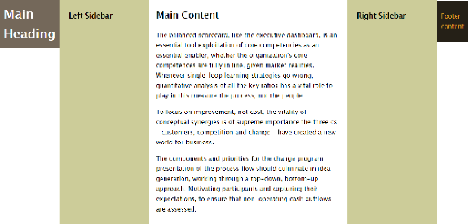
Figure 12-14.
The header and footer are converted to anonymous table cells
What happens is that the browser generates anonymous table cells around the header and footer, converting
the original table row of three columns into one containing five. Obviously, this is not the desired result. The
header and footer need to be treated as independent table rows.
Using Separate Table Rows for the Header and Footer
The styles in table_table-rows_and_cells_hf.html try to address the problem in Figure
12-14
by setting the
display
property of the header and footer to
table-row
like this:
#wrapper {
max-width: 1200px;
margin: 0 auto;
display: table;
}