HTML and CSS Reference
In-Depth Information
Table Cells Only
The styles in table-cells.html set the
display
property of the two sidebars and main content to
table-cell
.
No other table-related properties are used, but the
wrapper<div>
is given a maximum width and its horizontal
margins are set to
auto
to center it. The styles look like this:
#wrapper {
max-width: 1200px;
margin: 0 auto;
}
#sidebar1, #sidebar2 {
width: 25%;
padding: 0 2% 10px 2%;
background-color: #CC9;
display: table-cell;
}
#main {
width: 50%;
padding: 0 2% 10px 2%;
display: table-cell;
}
The width of each sidebar is set to
25%
and that of the
main<div>
to
50%
, which adds up to
100%
. The
2%
horizontal padding on each element doesn't affect the overall width. Because they're styled to display as table
cells, the standard CSS box model no longer applies. So, when the page is viewed at its maximum width of
1200px
, the overall width of each sidebar is
300px
, and the main content is
600px
,
including
padding. What's
more, the
2%
horizontal padding is based on the width of the whole table, and not on the width of the individual
element. Although the sidebars are only half as wide as the main content, all three elements have the same
24px
of left and right padding.
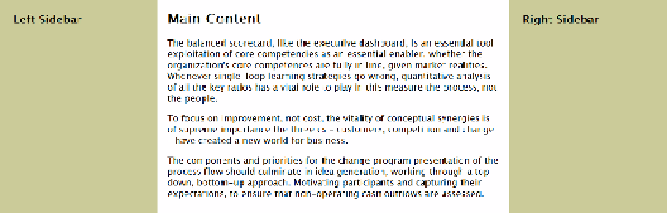
All browsers create an anonymous table row and an anonymous table around the cells to produce
three columns of equal height, as shown in Figure
12-11
. Even though the sidebars contain only headings,
the background color fills the full height. At screen widths greater than 1200px, the columns are centered
horizontally.
Figure 12-11.
Using CSS table cells on their own produces three columns of equal height