HTML and CSS Reference
In-Depth Information
■
Tip
The same basic principles apply to fixed-width layouts. Simply change the percentage values to pixels.
Creating a Single-column Layout
Single-column layout for desktop designs is relatively uncommon these days, but it is frequently used for mobile
design. All the HTML elements are displayed in the order they appear in the underlying code, so the main layout
considerations are the width of the column and whether you want it centered.
■
CSS3 Flexible Box layout allows you to display elements in a different order from the underlying HTML
(see Chapter 22). you can also change the order by manipulating the DoM with JavaScript.
Note
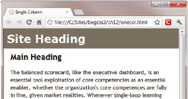
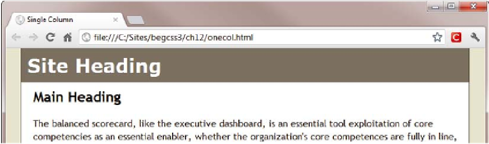
To restrict the width of a single-column layout, wrap everything between the
<body>
tags in a
<div>
, and give
the
<div>
an ID, such as
wrapper
. Use an ID selector to set the width of the
<div>
, and set its left and right margins
to
auto
. The single column in onecol.html in the ch12 folder is created like this:
#wrapper {
margin: 0 auto;
width: 100%;
max-width: 760px;
}
This fills the full width of a small screen, but produces the same result as a fixed layout when the browser
viewport is greater than
760px
(see Figure
12-1
).
Figure 12-1.
Setting a maximum width creates a responsive layout