HTML and CSS Reference
In-Depth Information
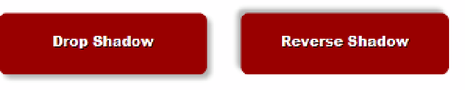
#drop2 {
box-shadow: -5px -5px 7px rgba(0,0,0,0.3);
}
Both rules set
box-shadow
using three lengths. The first two set the horizontal and vertical offsets,
respectively. In
#drop1
, the values are positive, so the shadow is to the right and down from the element. In
#drop2
, the values are negative, so the shadow is to the left and up. The third value sets the blur radius of the
shadow to
7px
. Finally, the color is set to black with 30 percent alpha transparency. Figure
9-15
shows the result.
Notice that the shadows follow the rounded corners of the elements.
Figure 9-15.
Negative values for the offsets produce a reverse shadow
Ti
■
Using a color with alpha transparency usually produces a more realistic shadow. All browsers that support
box-shadow
also support the
rgba()
and
hsla()
color formats.
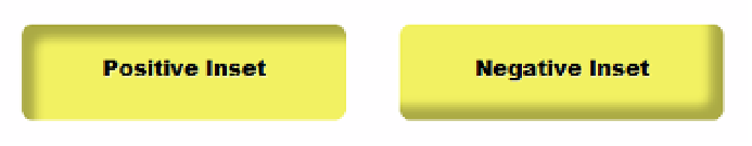
The next two rules add the
inset
keyword:
#inset1 {
box-shadow: inset 10px 10px 10px rgba(0,0,0,0.3);
}
#inset2 {
box-shadow: inset -10px -10px 10px rgba(0,0,0,0.3);
}
As Figure
9-16
shows, positive values draw the shadow from the left and top sides of the element. Although
this might appear odd, the shadow itself is being moved to the right and down. Similarly, the negative values are
being moved to the left and up, so the shadow comes from the bottom-right corner.
Figure 9-16.
Inset shadows are drawn inside the element
Adding a fourth length to the
box-shadow
values spreads the shadow color out in all directions by the
amount specified. However, the spread is affected by the horizontal and vertical offsets. So, if the spread is
smaller than the offsets, it's displayed only on the same sides as the shadow. If it's greater than the offsets, it
appears on all sides. The following style rules add a
4px
and
12px
spread, respectively.