Geoscience Reference
In-Depth Information
the above mentioned map contents). Therefore, decoration can support the
utility function of the cartographic work (early map). If we speak about the
aesthetic aspects of colours in early maps it is important to note the influ-
ence by the evolution of (reproduction) technologies and map creation
techniques. U. Ehrensvärd (in Woodward 1987) deals with this topic in de-
tail and starts a strong tradition of manually drawn (original) maps, in
which the author's handwriting plays an important role (see below). He
considers printed maps (woodcut) which are merely colorized a step back.
It is clear from artistic point of view this presents a real loss. This “mono-
chromatic age“ is relatively long, until the era of coloured printed maps.
But even at this time several direct colours are used for printing, or possi-
bly a limited number of colour networks (a sampler of printing rasters used
for printing maps). Only the most recent period of digital production and
printing equipment enabled us to come back to maps rich in colours (Bláha
2006).
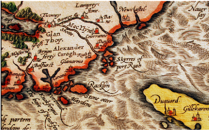
Figure 9:
A. Ortelius, Hiberniae Britannicae Insulae Nova Descriptio [1574]. Antwerp
Similarly to colour, the
description, or rather the font used
plays an impor-
tant role during aesthetic assessment. K. Kuchař (1974) deals especially
with the evolution of font in maps and the position of the description in re-
lation to the corresponding network and objects. He believes that wrong
choice of font not only influences the overall aesthetic effect of the map
(influence on the harmony of graphical expression) but also the legibility
and, thus, user-friendliness of the map. D. Woodward (1987) also focuses