HTML and CSS Reference
In-Depth Information
For example, the first line of the code below creates a text box to input the user's
last name and the second line creates a text box to input the user's password:
<p>Last Name: <input name=”lastname” type=”text” size=”25” /></p>
<p>Password: <input name=”password” type=”password” size=”12” /></p>
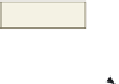
A
password control
also creates a text box used for a single line of input
(Figure 6-2), except that the characters entered into the field can appear as asterisks or
bullets. A password text box holds the password entered by a visitor. The password appears
as a series of characters, asterisks, or bullets as determined by the Web developer, one per
character for the password entered. This feature is designed to help protect the visitor's
password from being observed by others as it is being entered.
one bullet appears
for each character
in password
text boxes
password
text box
Figure 6-2 Text and password text controls.
The maximum length of the field may exceed the size of the field that appears on the
form. For example, consider a field size of three characters and a maximum length of nine
characters. If a Web page visitor types in more characters than the size of the text box (three
characters), the characters scroll to the left, to a maximum of nine characters entered.
A
checkbox control
allows a Web page visitor to (a) select one item from a
single-item list or (b) select more than one choice from a list of choices (Figure 6-3). Each
choice in a check box list can be either on or off. By default, all check boxes are deselected.
The default can be changed so a particular check box is preselected as the default, by using
the checked attribute and value (checked="checked") within the <input /> tag. Here is
sample code for a checkbox control. The first sample shows how to create a check box for
the type choice Country music. The second sample code shows that the Folk music type is
selected (or checked) when the Web page is loaded.
<input name=”musictype” type=”checkbox” value=”country”
/>Country
<input name=”musictype” type=”checkbox” checked=”checked”
value=”folk” />Folk
Radio Buttons
Old-time car radios were
operated by a row of
large black plastic buttons.
Push one button, and
you would get one preset
radio station. You could
push only one button at
a time. Radio buttons
on forms work the same
way as the old-time radio
buttons—one button at
a time. With check boxes,
more than one option can
be selected at a time.
A
radio control
limits the Web page visitor to only one choice from a list of choices
(Figure 6-3). Each choice is preceded by a
radio button
, or option button, which typically
appears as an open circle. When the visitor selects one of the radio buttons, all other radio
buttons in the list are automatically deselected. By default, all radio buttons are deselected.
To set a particular button as the default, you use the checked value within the <input />
tag. Here is the sample code to create two radio controls:
<input name=”purchases” type=”radio” value=”none” />Don't buy music
<input name=”purchases” type=”radio” value=”itunes” />iTunes