Environmental Engineering Reference
In-Depth Information
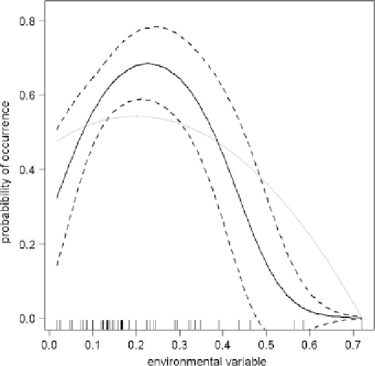
Fig. 13.3 Functional relationship between an environmental variable and a binary response. Rug
(ticks on lower axis) indicate for which
x
-values data were available.
Lines
represent a quadratic fit
(
solid
) and its standard deviation (
dashed
). Thin
grey line
is the true, underlying, data-generating
function. Note the few data points upon which the declining half of the function is based (6 of a
total of 50 have a value
0.35)
>
Spending time plotting is again well invested. We will detect errors in the model,
scratch our head over inexplicable (and hence overly complex) patterns, and be
forced to extract the main conclusions from it. It is this phase where the traditional
GLM is superior to the BRT, because variable interpretation is easier. It is,
however, also this phase where we may realize that BRTs are superior to GLMs
because they can model step-changes and thresholds much better. Personally,
I think we should not publish patterns we do not understand. There are, as the
previous steps have shown, several decisions that could generate artifacts and their
publication cannot be seen as progress.
13.3 Beyond Recipes: New Challenges for Species
Distribution Models
The above recipe can be used to derive a static description of environmental
correlates with distribution data. But they often leave the analyst unsatisfied.
Many assumptions might be suspected to be violated (Dormann 2007b), such as