Agriculture Reference
In-Depth Information
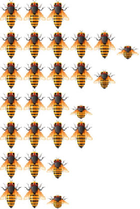
Fig. 8.10
Pictorial
presentation of a frequency
distribution of the no. of
insect per hill
Class
Frequency
Pictures
3.5 - 6.5
12
6.5 - 9.5 21
9.5 -12.5 18
12.5-15.5 13
15.5-18.5 16
18.5-21.5 11
21.5-24.5 9
Pictorial Diagram
(g)
: To make the information
lively and easy to understand by any user,
sometimes information is presented in picto-
rial forms. Instead of a bar diagram or line
diagram or pie chart, one can use pictures in
the diagrams. Let us take the example of the
no. of particular insects per hill of 100 varieties
of paddy; the frequencies can be represented
with suitably scaled figure. If we assume that
each insect represents four similar insects,
then the frequency distribution can be
represented in the following forms (Fig.
8.10
):
This type of pictorial representation is easy to
understand even by the layman and is more
eye-catching. But the problem with this type
of representation is that if the number of
figures does not exactly match with the fre-
quency, then some of the drawings are to be
kept incomplete like classes 4-7 and 10-13.
This type of data representation is easily
conceived by any person, but utmost care
should be taken to make the statistical map
true to the sense and scale, etc.
It should clearly be noted that all types of
presentation are not suitable for all types of
data, at all situations, and to all users. The appro-
priate type of presentation is to be decided on the
basis of the type of information, the objective of
the presentation, and the person concerned for
whom the presentation is basically meant.
8.2
Analysis of Data
Once after the processing and data presentation,
it is now imperative for a researcher to explain
and describe the nature of the research in a
deeper sense. In the first attempt, the researcher
tries to explain/describe the nature of the infor-
mation through measures of central tendency,
measures of dispersion, measures of asymmetry,
etc., taking one variable at a time—known as
univariate analysis. In his/her next endeavor,
he/she tries to find out the association among
the variables—which are coming under either
bivariate (taking two variables at a time) or
multivariate analysis (taking more than two
variables at a time). Once after completion of
the description (through univariate/bivariate/
(h)
Maps
: Statistical maps are generally used to
represent the distribution of particular
parameters like a forest area in a country,
paddy-producing zone, different mines
located at different places in a country, rain-
fall pattern, population density, etc. The map
shown in Fig.
8.11
gives the rainfall distribu-
tion during 1-6-12 to 25-7-12 for the whole
of India. The essence of a pictorial diagram
or map lies in their acceptability to a wide
range of users including the illiterate people.