Environmental Engineering Reference
In-Depth Information
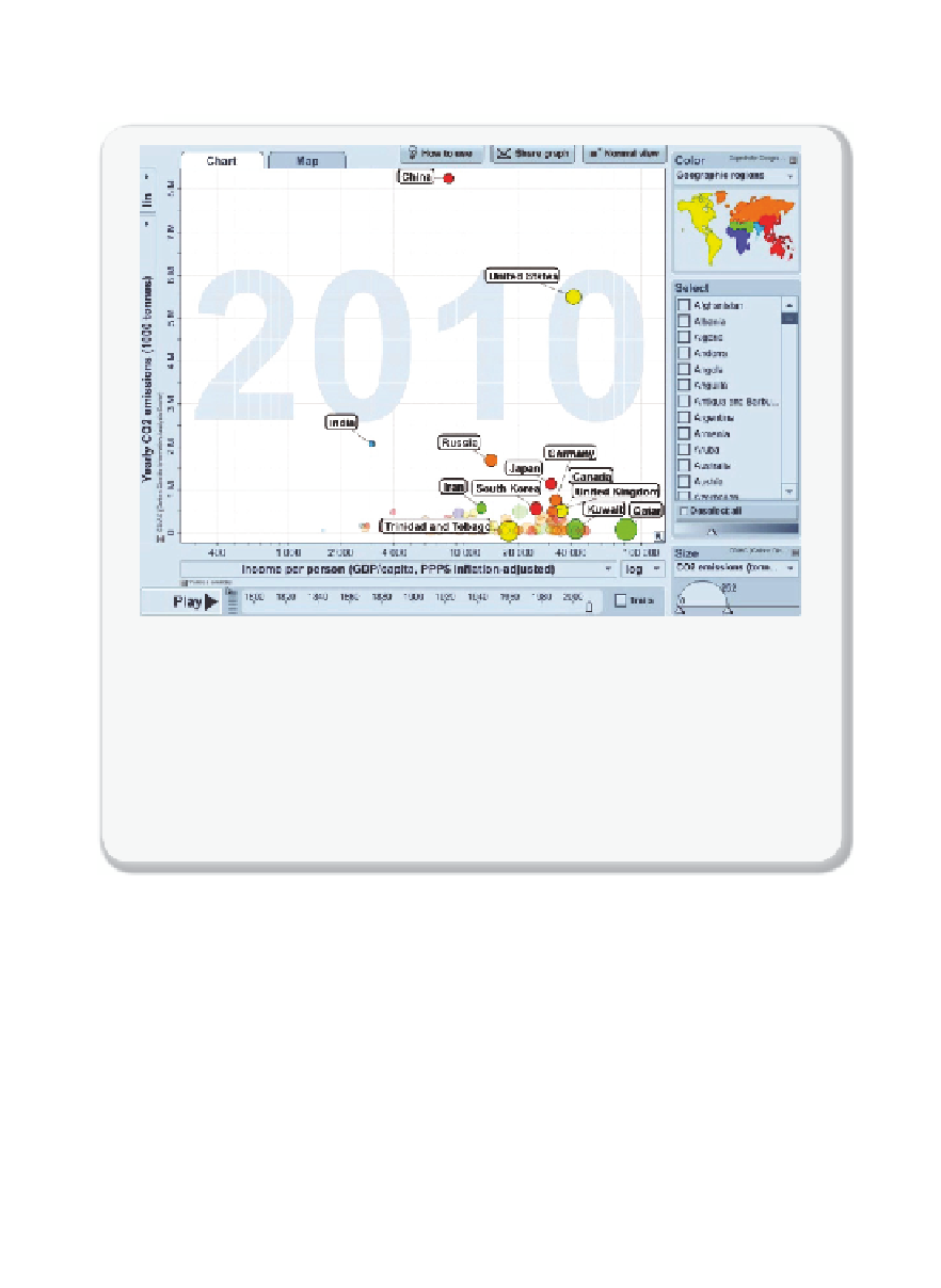
Movie 1.2.1
Historical carbon emissions for different countries
In 1820, at the dawn of the industrial revolution, the UK emitted the most CO
2
—
both
per person and in total. The USA overtook the UK by 1900, and recently in 2006 China
became the biggest emitter of CO
2
in the world. The movie shows the total CO
2
emission
as a function of income per person. The color of the circle represents the continent and
its size indicates CO
2
emission per person.
Source: Free material from
www.gapminder.
org
, data from the Carbon Dioxide Information Analysis Center
[1.7].
This movie can be
viewed at
: http://www.worldscientific.com/worldscibooks/10.1142/p911#t=suppl
illustrates the authors' logic. The graph gives annual individual emissions
(calculated for the year 2030) on the ordinate, and the population contributing
to that level of emissions on the abscissa. The blue-shaded region, for exam-
ple, shows that 1.1 billion people will be responsible for emissions in excess
of 10.8 tonnes per year of CO
2
. A plan to reduce the total carbon emissions
by 13 Gt CO
2
to 30 Gt CO
2
corresponds to a cap on emissions for those 1.1
billion people to 10.8 t CO
2
per year. Affording the poorest of the world an
additional 1 t CO
2
per year would require the highest emitters to decrease
their contributions from 10.8 to 9.6 t CO
2
per year. A policy based on indi-
vidual carbon emissions is deemed “fair and pragmatic.” If we think about
emission reductions in these terms, each country has an incentive to limit the
number of people in its population that emit above the world target.


Search WWH ::

Custom Search