Game Development Reference
In-Depth Information
Like
Toolbar
and
SelectionGrid
, you are required to pass in the current value and
it will return the updated value. However, unlike all the other controls, you actually
have two style points, so you can style the bar and the handle separately, giving you
a little more freedom and control over the look and feel of the sliders.
Normally, you would only use the
Slider
control; The main reason the
Scrollbar
is
available is that it forms the basis for the next control, the ScrollView control.
The ScrollView control
The last of the displayable controls is the
ScrollView
control, which gives you
masking abilities over GUI elements with optional horizontal and vertical
Scrollbars
.
Simply put, it allows you to define an area larger for controls behind a smaller
window on the screen, for example:
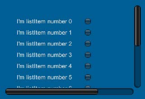
Example list implementation using a ScrollView control
Here we have a list that has many items that go beyond the drawable area of the
ScrollView
control. We then have the two scrollbars to move the content of the
scroll viewer up/down and left/right to change the view. The background content
is hidden behind a viewable mask that is the width and height of the
ScrollView
control's main window.
Styling the control is a little different as there is no base style for it; it relies on
the currently set default
GUISkin
(see the following
GUIStyles
section). You can
however set separate
GUIStyles
for each of the sliders but only over the whole
slider, not its individual parts (bar and handle). If you don't specify styles for each
slider, it will also revert to the base
GUIStyle
.