Geography Reference
In-Depth Information
DemoDairy Visualisation Evaluation Analysis
7
6
5
4
3
2
1
0
-3
-2
-1
0
1
2
3
Perceived Usefulness
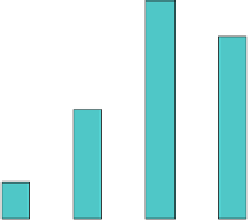
Fig. 7 Participants' (N = 15) responses to question ''To what extent do you see visualisation as
an improved communication tool relative to other form of data representation after seeing this
presentation?''
Other factors affecting the responses could be that the visualisations of future
climate could not be based on modeled ground truth data and were mainly illus-
trative of the potential of the tools. Previous work be Sheppard (
2005
) illustrating
sea level rise using realistic landscape visualisation resulted in more positive
responses, possibly because the message communicated was more simple to relate
to (a major change in a single environmental variable with clear implications for
the urban environment).
The results may also reflect the attendees' existing level of knowledge and
expertise. It would be valuable to repeat the exercise with local farmers, as one
participant commented: ''for these tools to be useful to farmers and used by them,
they must be (a) relevant to their farming operation, (b) easy to use''.
As a result of this work, the expectation that a combination of multiple visu-
alisation technologies embedded within digital globes could highly enhance the
capacity to display and communicate the result of complex scientific spatial
models is well supported.
6 Conclusion
There are many visualisation tools and techniques available to represent regional
and local scale information. Digital globes such as Google Earth are making
scientific information more accessible, including meteorological radar data and
satellite images (Butler
2006
). However, there is a limited understanding of the
utility of various visualisation techniques for engaging different audiences in
dealing with complex multi-dimensional problems such as climate change. There
are numerous ways datasets and biophysical models can be visualised; but which