HTML and CSS Reference
In-Depth Information
1.1.6. Progress bars, meters, and collapsible content
HTML5 defines a series of new elements that you can use to convey information to the
user. These include widgets that developers would previously have relied on third-party
JavaScript libraries for, such as progress bars, meters, and collapsible sections.
Using progress bars to show percentage completion
The
<progress>
element allows you to present the user with either a determinate or in-
determinate progress bar. A determinate progress bar has a given value, and the bar will
fill up to that value—this is useful for displaying the progress of a file upload, where you
dynamically update the value of the progress bar as the file is uploaded. An indeterminate
progress bar has no particular value, and the bar will be full but animated—this is useful for
informing the user that the application is loading when you're unsure of the exact progress
of the operation. An example of both types of progress bar is shown in
figure 1.3
.
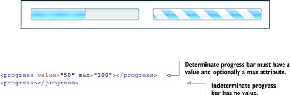
Figure 1.3. The left-hand progress bar is an example of a determinate progress bar. In this example, the value
of the bar is set to 50 percent, and the appearance of the bar reflects this because it's half filled. The right-hand
progress bar is an indeterminate bar and doesn't have a value. It displays an animated full bar to indicate that
something's happening, but the percentage complete isn't known.
The code to create the progress bars in
figure 1.3
is as follows:
Using meters to show users measures within known ranges
Following along the same path as the
<progress>
element is the
<meter>
element.
You'd use the
<progress>
element primarily to show the percentage of completion of
a task and you'd use the
<meter>
element to give a representation of a scalar measure-
ment within a known range. In addition to showing the value using a filled bar graphic, the
<meter>
element allows you to define low, high, and optimum ranges that you can use to