Java Reference
In-Depth Information
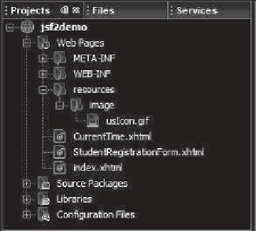
Step 2: Enter
resources
as the Folder Name and click
Finish
to create the
resources
folder, as shown in Figure 33.12.
Step 3: Right-click the
resources
node in the project pane to create the image folder
under resources. You can now place usIcon.gif under the image folder.
F
IGURE
33.12
The resources folder was created.
JSF provides
h:panelGrid
and
h:panelGroup
elements to contain and layout subele-
ments.
h:panelGrid
places the elements in a grid like the JavaFX
GridPane
.
h:panelGroup
places the elements like a JavaFX
FlowPane
. Lines 18-25 places six elements (labels and
input texts) are in a
h:panelGrid
. The
columns
attribute specifies that each row in the
grid has
6
columns. The elements are placed into a row from left to right in the order they
appear in the facelet. When a row is full, a new row is created to hold the elements. We used
h:panelGrid
in this example. You may replace it with
h:panelGroup
to see how the ele-
ments would be arranged.
You may use the
style
attribute with a JSF html tag to specify the CSS style for the ele-
ment and its subelements. The
style
attribute in line 18 specifies color green for all elements
in this
h:panelGrid
element.
The
h:outputLabel
element is for displaying a label (line 19). The
value
attribute
specifies the lable's text.
The
h:inputText
element is for displaying a text input box for the user to enter a text
(line 20). The
id
attribute is useful for other elements or the server program to reference this
element.
The
h:selectOneRadio
element is for displaying a group of radio buttons (line 30).
Each radio button is defined using an
f:selectItem
element (lines 31-34).
The
h:selectOneMenu
element is for displaying a combo box (line 41). Each item in the
combo box is defined using an
f:selectItem
element (lines 42 and 43).
The
h:selectManyListbox
element is for displaying a list for the user to choose multi-
ple items in a list (line 46). Each item in the list is defined using an
f:selectItem
element
(lines 47-49).
The
h:selectManyCheckbox
element is for displaying a group of check boxes (line 56).
Each item in the check box is defined using an
f:selectItem
element (lines 57-59).
The
h:selectTextarea
element is for displaying a text area for multiple lines of input
(line 66). The
style
attribute is used to specify the width and height of the text area (line 67).
The
h:commandButton
element is for displaying a button (line 71). When the button is
clicked, an action is performed. The default action is to request the same page from the server.
The next section shows how to process the form.
h:panelGrid
the
style
attribute
h:outputLabel
h:inputText
h:selectOneRadio
h:selectOneMenu
h:selectManyListbox
h:selectManyCheckbox
h:selectTextarea
h:commandButton


Search WWH ::

Custom Search