Graphics Reference
In-Depth Information
Like the Sketch effect, we also can produce two kinds of outputs with this effect:
outline and colored renders. This is very obvious when we look into the settings and
see the
Outline vs fill
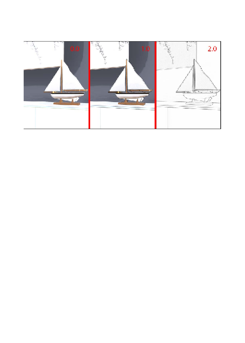
setting, and with this setting, we can go from an image with
only color to just an outline, as shown in the following screenshot:
This is what is going to set the mood for our illustration, and while working with
this effect, it is easy to see it is a special feature. This effect blends so perfectly with
the scene that it preserves a good amount of detail found in the textures. The frame
on the wall is a good example of how even when using the full outline, we can see
the picture, and this can be perceived in all the texture we use for the project. This
is good because it adds a nice effect to the illustration. However, what if we want to
use some color?
The
Fill
method,
Tone count
, and
Coloring
are the settings that control the working
of the color, and here is a brief explanation of how they work:
•
Fill
: This can be used to create a nice transition between colors or to create
harsh areas of color
•
Tone count
: This increases or decreases the amount of tones in the scene,
which affects the color detail available
•
Coloring
: This creates a black-and-white image when close to
0
, or an
over-saturated image when close to
2
What about the
Pattern
setting? This is an interesting setting because it adds a
nice stippling texture to the entire image and, in some circumstances, can remove
blotchiness in some dark areas. Keep in mind that this setting only affects the image
when we are using color and not an outline image.