HTML and CSS Reference
In-Depth Information
The syntax may look a little odd because you have to wrap style blocks with more curly
braces, like so:
<style type="text/css">
@media screen {body
{font-family: sans-serif;
font-size: 14px;}
}
@media print {body
{font-family: serif;
font-size: 10px;}
}
</style>
Similar to limitations of inline styles for supporting pseudo-classes and pseudo-elements,
it is not possible at the time of this edition's writing to build equivalent media-specific syntax
into a value present in an element's core
style
attribute. However, given the previous
discussion of possible changes to inline styles, it seems likely that syntax like
<p style="@media print {line-height: 100%; font-size: 10px;}
@media screen {line-height: 150%;}">
This is a test.
</p>
might someday be supported in a browser. However, this is purely speculation on the
author's part, and the example and discussion here should be yet more indication that
inline styles have their limitations.
N
OTE
One exciting emerging use of
media
attributes and
@media
directives is the use of queries
to apply different looks depending on device characteristics. See the Chapter 6 section “Media
Queries” for more information.
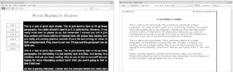
Printer-Specific CSS
Currently, the main use of media-specific style sheets is to specify one style sheet for
printing and one for viewing onscreen, as demonstrated here: