Information Technology Reference
In-Depth Information
Rule 6:
Use a contour plot over a perspective plot if a good view-
point is not available. Always use a contour plot over the perspec-
tive plot when the axes denote map coordinates.
Though the contour plot is generally a better representation of mapped
data, a desire to improve Figure 8.8 would lead us to suggest that the grid
lines should be drawn in a lighter font so that they have less emphasis
than lines for the data surface. Another improvement to data illustrated
according to real-world maps is to overlay the contour plot where certain
known places or geopolitical distinctions may be marked. The graphic
designer must weigh the addition of such decorative items with the
improvement in inference that they bring.
ONE RULE FOR THE MISUNDERSTOOD PIE CHART
The pie chart is undoubtedly the graphical illustration with the worst rep-
utation. Wilkinson (1999) points out that the pie chart is simply a bar
chart that has been converted to polar coordinates.
Focusing on Wilkinson's point makes it easier to understand that the
conversion of the bar height to an angle on the pie chart is most effective
when the bar height represents a proportion. If the bars do not have
values where the sum of all bars is meaningful, the pie chart is a poor
choice for presenting the information (cf. Figure 8.10).
16
18
1
2
3
4
5
11
22
14
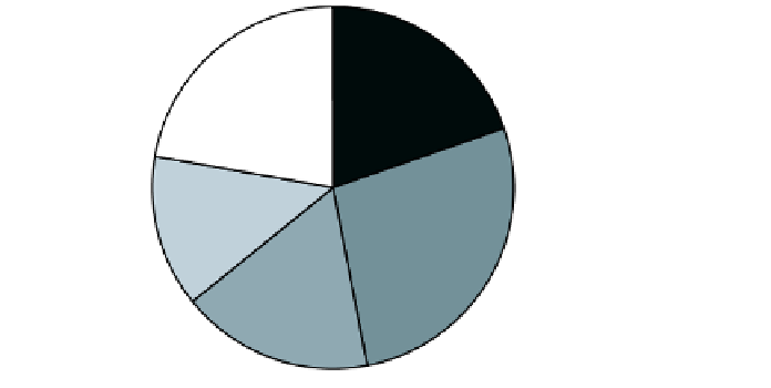
FIGURE 8.10
Total Number of Goals Scored by Teams 1 through 5.
The
legend indicates the team number and associated slice color for the number of
goals scored by the respective team. The actual number of goals is also included.
Problem:
The sum of the individual values is not of interest so that the treatment
of the individuals as proportions of a total is not correct.