Information Technology Reference
In-Depth Information
ways we can describe this set of outcomes to the reader. In text above, we
simply communicated the results in text.
A more effective presentation would be to write that the total number of
goals scored by teams 1 through 5 was 16, 22, 14, 11, and 18, respectively.
The College Station Soccer Club labeled the five teams as Team 1, Team 2,
and so on. These labels show the remarkable lack of imagination that we
encounter in many data collection efforts. Improving on this textual
presentation, we could also say that the total number of goals with the team
number identified by subscript was 22
2
, 18
5
, 16
1
, 14
3
, and 11
4
. This
presentation better communicates with the reader by ordering the out-
comes because the reader will naturally want to know the order in this case.
FIVE RULES FOR AVOIDING BAD GRAPHICS
There are a number of choices in presenting the soccer outcomes in
graphical form. Many of these are poor choices; they hide information,
make it difficult to discern actual values, or inefficiently use the space
within the graph. Open almost any newspaper and you will see a bar chart
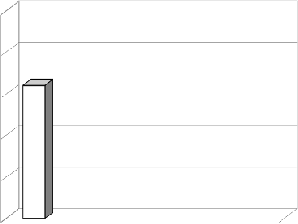
graphic similar to Figure 8.1 illustrating the soccer data. In this section,
25
20
15
10
5
0
1
2
3
4
5
FIGURE 8.1
Total Number of Goals Scored by Teams 1 through 5.
The
x
axis indicates the team number, and the
y
axis indicates the number of goals scored
by the respective team.
Problem:
The false third dimension makes it difficult to
discern values. The reader must focus on the top of the obscured back face to
accurately interpret the values plotted.


