Information Technology Reference
In-Depth Information
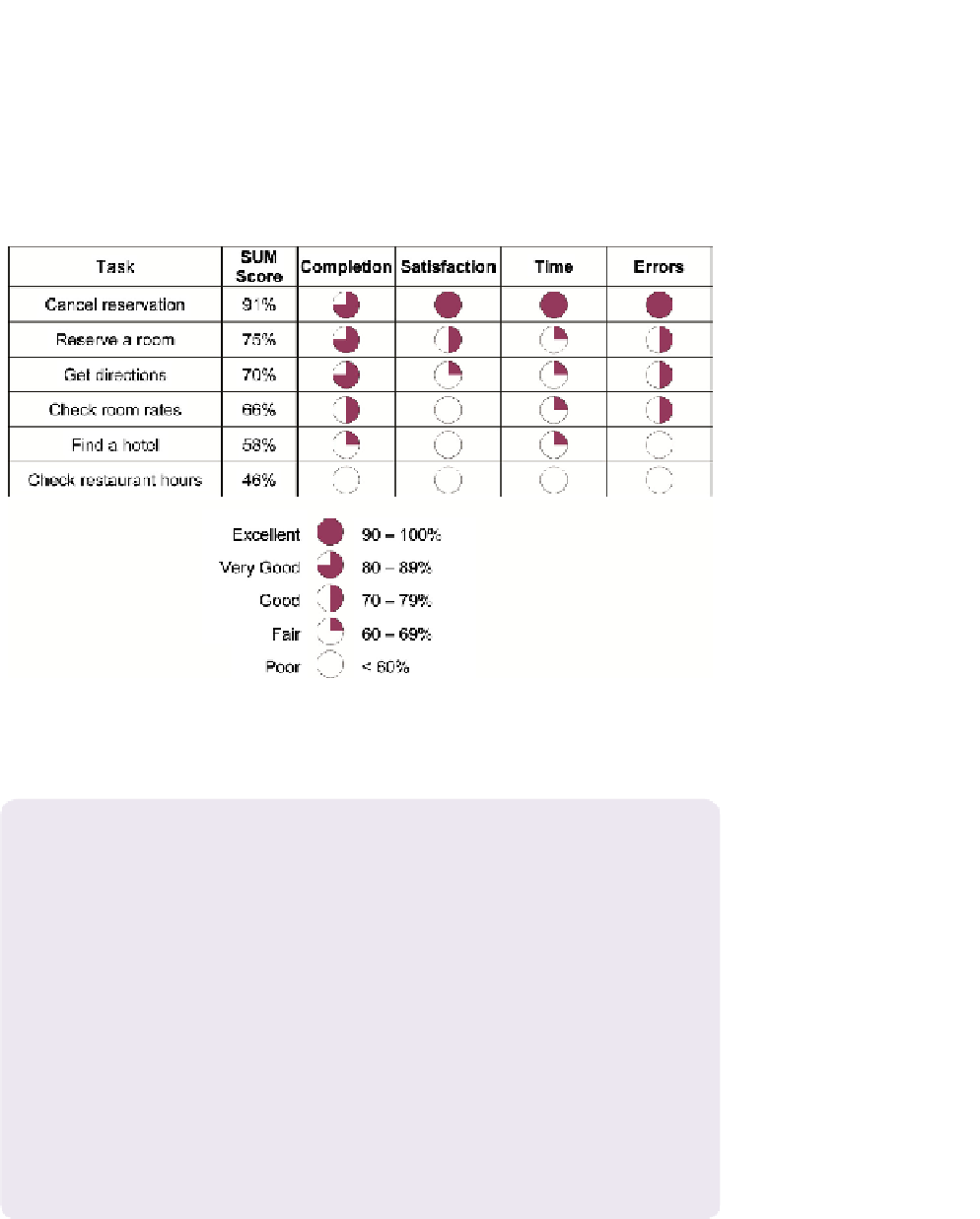
example, consider the data shown earlier in
Table 8.7
, which presents the results
for six tasks in a usability test, including task completion, time, satisfaction,
and errors. These data could be summarized in a comparison chart as shown in
Figure 8.5
. This type of comparison chart allows you to see at a glance how the
participants did for each of the tasks (by focusing on the rows) or how the par-
ticipants did for each of the metrics (by focusing on the columns).
Figure 8.5 A sample comparison chart using data from
Table 8.7
. Tasks have been ordered by their SUM
score, starting with the highest. For each of the four standardized scores (task completion, satisfaction,
task time, and errors), the value has been represented by coded circles (known as Harvey Balls), as
shown in the key.
WHAT ARE HARVEY BALLS?
Harvey Balls are small, round pictograms used typically in a comparison table to
represent values for different items:
They're named for Harvey Poppel, a Booz Allen Hamilton consultant who created them
in the 1970s as a way of summarizing long tables of numeric data. There are five levels,
progressing from an open circle to a completely filled circle. Typically, the open circle
represents the worst values, and the completely filled circle represents the best values.
Links to images of Harvey Balls of different sizes can be found on our website,
www.
MeasuringUX.com
. Harvey Balls shouldn't be confused with Harvey Ball, who was the
creator of the smiley face ☺!


Search WWH ::

Custom Search