Information Technology Reference
In-Depth Information
the usability test in such a way that overall trends and important aspects of
the data can be detected easily, such as tasks that were particularly problem-
atic for the users. If you only have two metrics that you're trying to represent, a
simple combination graph from Excel may be appropriate. For example,
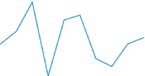
Figure
8.3
shows the task completion rate and task ease rating for each of 10 tasks in a
usability test.
Task Success and Task Rating for 10 Tasks
100%
4.0
90%
3.5
80%
3.0
70%
2.5
60%
50%
2.0
40%
1.5
30%
1.0
20%
0.5
10%
0%
0.0
Task 1
Task 2
Task 3 Task 4Task 5Task 6Task 7Task 8Task 9Task 10
Task Rating (0-4) Task Success
Figure 8.3 A sample combination column and line chart for 10 tasks. Task rating is shown via the
columns and labeled on the right axis. Task success is shown via the lines and is labeled on the left axis.
The combination chart in
Figure 8.3
has some interesting features. It clari-
fies which tasks were the most problematic for the participants (Tasks 4 and 8)
because they have the lowest values on both scales. It's also obvious where there
were significant disparities between task success data and task ease ratings, such
as Tasks 9 and 10, which had only moderate task completion rates but the high-
est task ratings. (This is an especially troubling finding because it might indicate
that some of the users did not complete the task successfully but thought they
did.) Finally, it's easy to distinguish the tasks that had reasonably high values for
both metrics, such as Tasks 3, 5, and 6.


Search WWH ::

Custom Search