Information Technology Reference
In-Depth Information
interacting with a site, users completed a questionnaire that included six state-
ments related to the site map:
•
Thesitemapiseasytofind
•
Theinformationonthesitemapishelpful
•
Thesitemapiseasytouse
•
ThesitemapmadeiteasytofindtheinformationIwaslookingfor
•
Thesitemapmadeiteasytounderstandthestructureofthewebsite
•
Thesitemapmadeitclearwhatcontentisavailableonthewebsite
Each statement was accompanied by a seven-point Likert scale of “Strongly
Disagree” to “Strongly Agree.” They then averaged the ratings from the six scales
to get an overall rating of the site map for each of the 10 sites. This is an example
of getting more reliable ratings of a feature of a website by asking for several dif-
ferent ratings of the feature and then averaging them together.
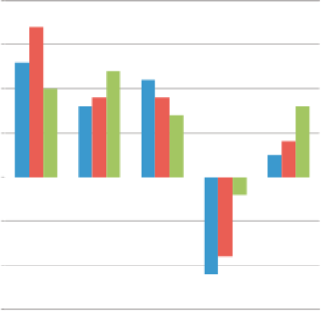
Tullis (1998) conducted a study that focused on possible homepage designs
for a website. (In fact, the designs were really just templates containing “place-
holder” or “Lorem Ipsum” text.) One of the techniques used for comparing the
designs was to ask participants in the study to rate the designs on three rating
scales: page format, attractiveness, and use of color. Each was rated on a five-
point scale (−2, −1, 0, 1, 2) of “Poor” to “Excellent.” (Note to self and others:
Don't use that scale again. It tends to bias respondents away from the ratings
associated with the negative values and zero. But the results are still valid if the
main thing we're interested in is the relative
comparison
of the ratings for the
different designs.) Results for the five designs are shown in
Figure 6.24
. The
Subjective Ratings by Template
2.0
1.5
1.0
0.5
Format
Attractiveness
Color
0.0
Template 1 Template 2 Template 3 Template 4Template 5
-0.5
-1.0
-1.5
Figure 6.24 Data in which five different designs for a website's homepage were each rated on three
scales: format, attractiveness, and use of color. Adapted from Tullis (1998); used with permission.


Search WWH ::

Custom Search