Database Reference
In-Depth Information
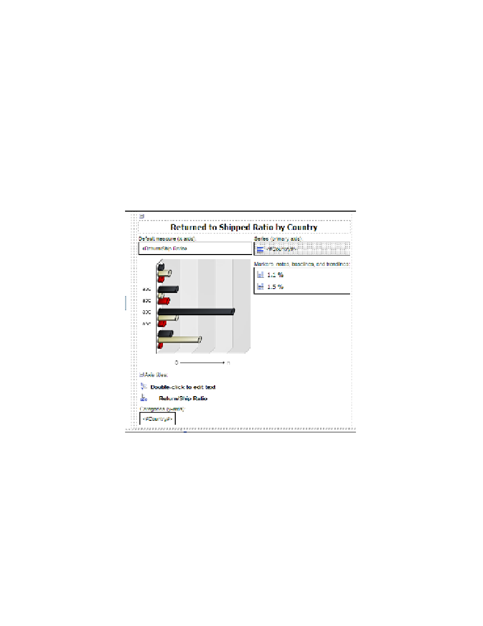
34.
Change the
Source Type
property from
Te x t
to
Data Item Label
.
35.
Click inside the
Data Item Label
property that shows up below the
Source Type
prop-
erty, and from the drop-down menu select the
Return/Ship Ratio
data item.
36.
Click on the
Bar
icon in the
Series (primary axis)
area, to the left of the
Country
data item.
37.
In the properties of the
Bar
object, double-click the
Palette
property.
The Palette dialog box opens.
38.
Click on the
Chart Palette Presets
button in the upper-left corner of the dialog box, and
from the drop-down menu select the
Contrast
palette.
39.
Click
OK
to close the Palette dialog box.
Yo u r b a r c h a r t d e s i g n s h o u l d l o o k similar Figure 6.36 at this point.
Figure 6.36
Bar chart design
Step 10: Format the Pie Chart
The pie chart should have the legend hidden as we plan to show the pie slice names and values as
percentages on the chart. We will adjust the titles and size of the pie chart at this point too.
1.
Click on the pie chart to select it.
2.
In the
Properties
pane, change the
Axis Title
property from
Show
to
Hide
.
3.
Change the
Title
property from
Hide
to
Show
.