Database Reference
In-Depth Information
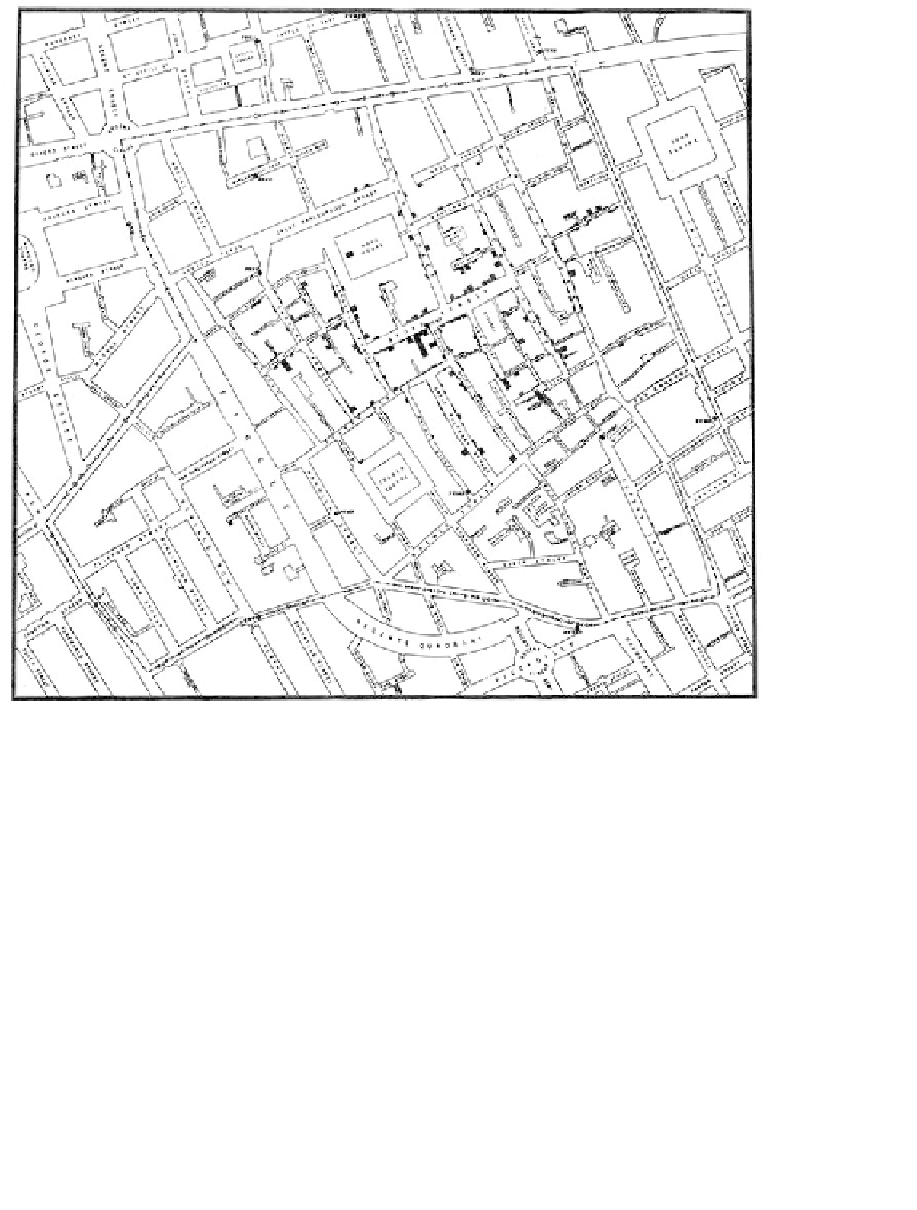
Figure 7.1
19th-century epidemiology pioneer John Snow's famous dot-
distribution map communicating the impact of an 1854 cholera outbreak
near London's Broad Street
million troops tromping into Russia. A timeline is included, as well as a line graph
visualization of the temperature over time. Famously, as the winter temperatures
decreased over time, Napoleon's troops began to succumb to the cold, lack of supplies,
and other logistical disasters. Minard depicts the dwindling size of the army during the
retreat using a black, increasingly narrowing line, closely mirroring the drop in the
temperature over time. Although this information visualization is widely known to be
a masterpiece, Minard's graphic also tells only one side of the story—nearly as many
Russian troops, as well as a great deal more civilians, perished as well, making this
conflict one of the most deadly in history.

Search WWH ::

Custom Search