Database Reference
In-Depth Information
24,000
12,000
daily aggregates
22,000
11 , 0 00
Event day 4
Event day 8
hourly aggregates
11 pm
20,000
10,000
Event day 1
11 pm
18,000
9,000
Event day 7
16,000
Event day 5
8,000
Event day 2
11 pm
Event day 6
Event
day 9
14,000
7, 0 0 0
Event day 3
11 pm
10 pm
12,000
6,000
5 pm
8 pm
10 pm
6 pm
10 pm
10,000
5,000
6 pm
10 pm
8,000
4,000
6,000
3,000
4,000
2,000
2,000
1,000
7 am
7 am
8 am
8 am
6 am
9 am
7 am
8 am
0
Sat 17
0
Sun 18
Mon 19
Tue 20
Wed 21
Thu 22
Time
Fri 23
Sat 24
Sun 25
Mon 26
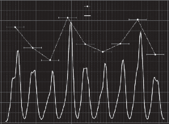
Figure 14.4 Daily (dashed line, event days starting and ending at 7 A.M.) and hourly (solid
line) number of detected phones over the entire Ghent Festivities 2010 event zone as
an indicator of crowdedness. Solid vertical gridlines point to midnights, dashed vertical
gridlines are plotted every 4 hours.
to define a day. Looking at the hourly crowdedness, it is clear that it does not
make much sense to define days starting and ending at midnight because that
is generally the most crowded period of the day. Doing so would cause the
Bluetooth observations to be segmented by unnatural breaks. Consequently, we
have considered the starting point of an “event day” to coincide with the on
average least crowded moment of a day, that is, 7 A.M. The daily aggregates
again show the three busiest days, with day 4 peaking at almost 20,500 detected
phones or 190,000 visitors.
Although the number of visitors present at a certain location and time is
already a good indicator for the likelihood of safety issues, the movement of
visitors from one location to another offers even more insight into the spatio-
temporal dynamics of a crowd. Although only flows of visitors carrying dis-
coverable Bluetooth devices can be reconstructed, the discovered patterns and
trends can aid stakeholders in making well-informed decisions regarding crowd
management and security in general. By making a time series of these flow
diagrams, it is possible to investigate the time dependency of certain visitor
flows.
Figure
14.5
shows a visualization of such dynamic visitor flows in Google
Earth, comparable to the figures presented in Chapter
8
.TheKMLfilewas
generated in the GisMo environment and can be animated in time. Four snapshots