Graphics Reference
In-Depth Information
Matching the rendered view to a resized
browser
When you define a camera in Three.js, you need to define the aspect ratio; for a ren-
derer, you need to define its output size. Normally, you do this once when you set up
your initial scene. This works great until the user resizes their browser. In this case,
the aspect ratio for the camera will probably change, as will the output size for the
renderer. In this recipe, we'll show you the steps you need to take to react to changes
to the screen size.
Getting ready
As with every recipe, we provide an example that you can use to test and experiment
with for this recipe as well. Open
03.06-change-the-camera-on-screen-res-
ize.html
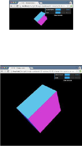
in your browser and make the screen very small.
What you see is that the same amount of information is shown in the scene—only
rendered smaller. When you now increase the screen size again, you'll see that
Three.js always uses the complete available space.

