HTML and CSS Reference
In-Depth Information
To set a check box to the checked state, a Boolean
checked
attribute is added. Only
check boxes that are checked will have their data submitted with the form. The
value
attribute can be used to set the value sent when the form is submitted, but it may be
omitted, in which case the default value will be the text “on.” The check boxes in
Figure
4-7
might look like this:
<input type="checkbox" name="option1" id="option1" />
<input type="checkbox" name="option2" id="option2" checked
/>
<input type="checkbox" name="option3" id="option3" />
When these are submitted as part of a form, the web page's URL will be appended
with the querystring
?option2=on
(if using the GET method).
Radio buttons
Like check boxes, radio buttons are probably something you have run into before. They
are perhaps a little less common but still widely prevalent on the Web. A
radio
input
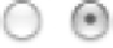
has two states, either selected or not, as shown in
Figure 4-8
.
Figure 4-8.
Two radio buttons, one selected and one not
You use radio buttons to indicate that only one choice out of several—a
radio
group
—can be selected.
To indicate to the user agent that a radio button is part of a group, you give each radio
input element an identical value for their
name
attribute. When the form is rendered, the
user agent will not allow more than one radio input to be selected if that input shares a
name value with another. Here's the markup for the preceding example:
<input type="radio" name="example" value="first" />
<input type="radio" name="example" value="second" checked
/>
As you can see in the previous code, the state of a radio button can, like a check box,
be preset with the
checked
attribute.
Note
A real-world form would also include form labels, but we'll get to those in the
section “Adding structure with fieldsets and labels.”


Search WWH ::

Custom Search