Database Reference
In-Depth Information
Figure 9-21.
Launching Power View for Excel
This launches a new Power View window with the PowerPivot model already available to it. With the Power View
window open, you are now ready to create a report, chart, or other visualization. Here are the steps to follow:
1.
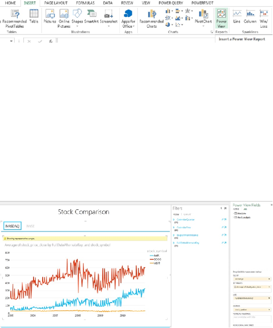
Once Power View opens, click on the chart to select and highlight it. Drag and drop
Average of stock_price_close
into the
fields
section.
2.
Click the
Line Chart
graph in
Design
ribbon to switch to the chart and expand the graph to
fit it to the canvas.
3.
Change the title to
Stock Comparison
.
4.
Drag
Hdate
to the
Filters
field in the report.
5.
Drag
exchange
to the
Tile By
column.
6.
Drag
FullDateAlternateKey
to
Axis
.
7.
Drag
stock_symbol
to
Legend
.
Once the design is complete, you should be able to see the Power View report comparing the different stock prices in
a line chart. It is categorized based on the NASDAQ and NYSE, and it gives you a visualization of the stock prices
with just a few clicks. Your Power View report should now look like Figure
9-22
.
Figure 9-22.
The Stock Comparison report