Graphics Programs Reference
In-Depth Information
@media
all and (min-width: 60.01em) and (max-width: 75em) {
.quotebox:nth-child(4n+
1) {
clear
:
left
;}
}
@media
all and (min-width: 45.51em) and (max-width: 60em) {
.quotebox:nth-child(3n+
1) {
clear
:
left
;}
}
@media
all and (min-width: 30.01em) and (max-width: 45.5em) {
.quotebox:nth-child(2n+
1) {
clear
:
left
;}
}
@media
all and (max-width: 30em) {
.quotebox
{
float
:
none
;}
}
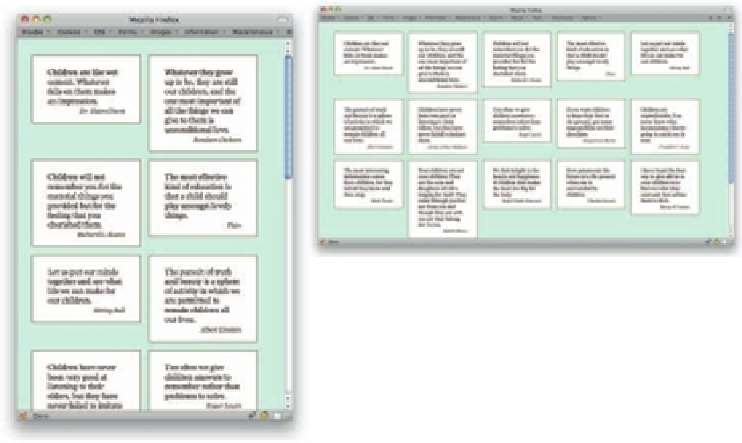
243
Figure 7-10: Two views of an adaptable fl oated grid.
Note that this particular set of queries is based on the width of the display area of the browser
as measured in ems. h at helps make the layout much more adaptable to changes of text size
and browser window.
If you're interested in selecting every other element—say, every other table row—there are
some more human alternatives to
2n+1
. You can select even-numbered or odd-numbered
children using
:nth-child(even)
and
:nth-child(odd)
, as in this example.
tr:nth-child(odd)
{
background
:
#EEF
;}
STYLING OCCASIONAL COLUMNS
It's easy enough to select alternate table rows for styling, but how about table columns?
Actually, that's just as easy, thanks to the
:nth-child
and
:nth-of-type
selectors.


Search WWH ::

Custom Search