Graphics Programs Reference
In-Depth Information
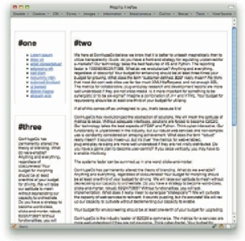
Figure 7-5: The reworked layout, which shows between 500 and 800 pixels.
And i nally, you can apply some single-
column styles for any medium with fewer
than 500 pixels of display width (see
Figure 7-6).
238
@media
all and (max-width: 499px) {
#one
{
text-align
:
center
;}
#one
li
{
display
:
inline
;
list-
style
:
none
;
padding
:
0
0.5em
;
border-right
:
1px
solid
gray
;
line-height
:
1.66
;}
#one
li:last-child
{
border-right
:
0
;}
#three
{
display
:
none
;}
}
Note that in all these queries, layout styles are
dei ned in relation to the display area of the
browser window. More generically, they are
dei ned in relation to the display area
available to the document in any medium in
which it is rendered. h at means that if a
printer, for example, is used to print the
document and it has an available display area
784 pixels wide, then the two-column layout
will be for printing.
Figure 7-6: Single-column layout, which shows below
500 pixels.


Search WWH ::

Custom Search