Graphics Programs Reference
In-Depth Information
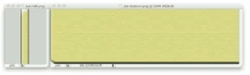
h en you cut it into two pieces: a narrow strip from the let , and everything else, as in Figure
5-32.
Figure 5-32: The two “doors” of each tab.
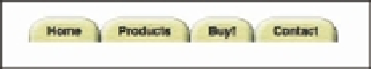
Believe it or not, that's all you need image-wise. Now you need the proper CSS (see Figure
5-33 for the i nished product):
ul.nav
,
ul.nav
li
{
float
:
left
;
margin
:
0
;
padding
:
0
;
list-style
:
none
;}
ul.nav
{
width
:
100%
;}
ul.nav
li
{
background
:
url(tab-right.png)
no-repeat
100%
0
;}
ul.nav
li
a
{
background
:
url(tab-left.png)
no-repeat
;
display
:
block
;
padding
:
10px
25px
5px
;
font
:
bold
1em
sans-serif
;
text-decoration
:
none
;
color
:
#000
;}
183
Figure 5-33: The end result.
And that's done it—you have tabs!
h e reason this works is easy to see if you temporarily remove the background image from the
links. Once they're dropped, you can see the great big right-side-of-tab image i lling out the
entire list item. Of course the link sits inside that, so when you add the let -side-of-tab stripe
to the let side of the link, it sits overtop the let side of the list item's background.
Now, suppose you want the tabs to light up when they're hovered. h ere are two ways to do it,
both making use of arbitrary-element hovering. h e simplest is to swap out the images.
ul.nav
li:hover
{
background-image
:
url(tab-right-hover.png)
;}
ul.nav
li:hover
a
{
background-image
:
url(tab-left-hover.png)
;
color
:
#FFF
;}
h e drawback there is that the i rst time a tab is hovered at er the page is loaded, there will be a
slight delay while the images are fetched from the server. To avoid that, merge the CSS sprites
technique (see preceding section) with this one. Now the tab slices look like Figure 5-34.


Search WWH ::

Custom Search