Graphics Programs Reference
In-Depth Information
EM-BASED LAYOUT
h is technique is strikingly similar to the Fluid Grid technique, only here the layout dimen-
sions are specii ed in ems instead of percentages.
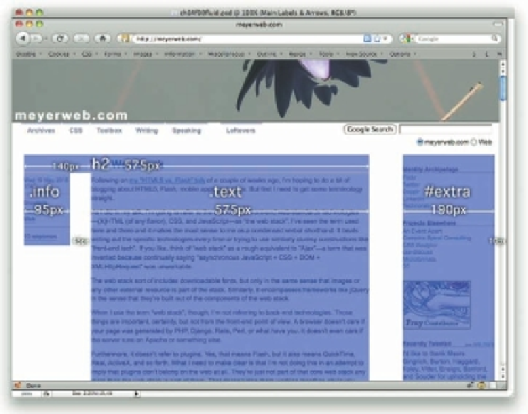
As before, we'll start with a layout mockup with some “top-level” measures placed over top
and the associated CSS (see Figure 4-37).
#contain
{
width
:
1010px
;}
#main
,
#extra
{
float
:
left
;}
#main
{
width
:
715px
;
padding
:
20px
35px
20px
25px
;}
#extra
{
width
:
190px
;
padding
:
20px
10px
20px
35px
;}
144
Figure 4-37: Visualizing the layout sizes for the whole design.
Great. Time once more for math. h is time around, we divide all these numbers by the
“baseline” font size we're using in our page. h is is generally the font size set for the
body
or
html
element. If you were to foreswear the use of all
font-size
, then the baseline font size
in the vast majority of browsers would be 16 pixels, because that's the default preference
setting and almost nobody ever changes it. If, on the other hand, you said something like
body {font-size: 0.8215em;}
, then the baseline you're setting is 13 pixels.


Search WWH ::

Custom Search