Graphics Programs Reference
In-Depth Information
Liquid Bleach starts out much like faux columns, but with an addition.
<
div
class
="contain">
<
div
class
="inner">
<
div
class
="column
one
"
>
...
</
div
>
<
div
class
="column
two
"
>
...
</
div
>
<
div
class
="column
three
"
>
...
</
div
>
</
div
>
</
div
>
To make this work, you need one container for every gap between columns; or, if you prefer,
you need one less container than you have columns. Since we have three columns here, we
need two containers. Additionally, we'll need one separator and/or background pattern for
each container.
To get started, we'll add some liquid-width styles.
.column
{
width
:
20%
;
margin
:
0
5%
;
float
:
left
;}
.two
{
width
:
30%
;}
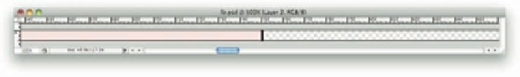
h en we'll take just one background image. Note that Figure 4-21 shows just a portion of the
image itself, which is actually 3,000 pixels wide (really!).
128
Figure 4-21: The fi rst separator image.
Note that the image has a i lled color to the let of the separator, and complete transparency to
the right. (h e gray checkerboard pattern is Photoshop's stand-in for the transparent part of
the image.)
Here's the important part: h e separator has to line up with the gap between two columns. In
this case, we'll place it between the let most and center columns (see Figure 4-22). We want
the separator to land 25% of the way across the container, as that's the point between the two
let most columns. So two things have to be done.
First is that, as implied in the preceding i gure, the separator image is 25% of the way across
the whole 3,000-pixel-wide image. h erefore, its midpoint is 750 pixels from the let edge of
the image.
Second is this CSS:
.inner
{
background
:
url(lb01.png)
25%
0
repeat-y
;
overflow
:
auto
;}


Search WWH ::

Custom Search