Database Reference
In-Depth Information
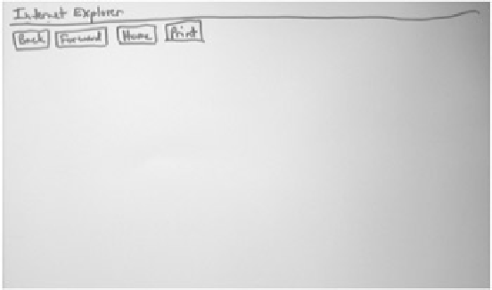
pieces are placed on top of this background. Note that the toolbar icons have been replaced by
their corresponding words.
Browser Backgrounds
For a Web browser, the version or brand isn't relevant in paper prototype testing. As a rule, you need
only the most common browser buttons: Back, Forward, Home, and maybe Print or Search. In my
experience, users understand these buttons just fine when they're drawn by hand; a screen shot of real
browser buttons is often harder to read.
Figure 4.5
shows an example of a browser background.
Figure 4.5:
A background for testing a Web site can consist of just the most common browser
buttons. The browser brand or version isn't important—this background says "Internet Explorer"
simply to inform users they're looking at a Web browser.
I usually omit the buttons for Stop and Reload—these browser controls aren't needed for paper
prototype usability tests because there is nothing to "download." Similar logic applies for omitting
bookmarks and the URL field—if you're testing a specific Web site you've probably made the
assumption that the user got there by some means that's outside of what you're trying to test. I typically
start the usability test by telling users, "You've opened your favorite Web browser and typed in
www.whatever.com
." In my experience most users don't navigate within a Web site by hacking the
URL field (and if we're trying to test the site's navigation, we don't want them to), so I feel pretty safe
leaving it out.
Beware of making assumptions about how users will access your site because your assumptions
may be wrong. It can be an eye-opener to start a usability test by showing users the ad or direct
mail piece used to promote the site and asking them, "How would you investigate this?" One of
my former clients was a start-up company that had just mailed 100,000 brochures for the
purpose of driving traffic to their site and then brought me in to do some usability testing.
Unfortunately, the URL was so hard to pick out of the brochure that most users (who were quite
interested in the concept of the site) couldn't tell me what they'd type in to get there. Start-up
companies can't afford many errors like this one; last time I visited the site, the fine print
explained that the original company "ran through millions of dollars and went out of business."
A note for both software applications and Web sites: If you're placing several prototype pieces on a
background, users sometimes get confused as to whether they're looking at several different windows
or one window that happens to be made up of several pieces of paper. When I see this happen, I
simply tell users, "This is all one screen," which usually alleviates the confusion.
Small-Screen Interfaces
In prototyping a small-screen device such as a personal digital assistant (PDA) or wireless phone,
sometimes pixels count. When screen real estate is scarce, you may want to incorporate display
constraints even for your initial prototyping efforts. It depends on what you're trying to learn from
usability tests; in the early stages when you're still trying to understand users' needs or nail down the
functionality, size may not be as critical as it is in the later stages of the project. Following are examples


Search WWH ::

Custom Search