Database Reference
In-Depth Information
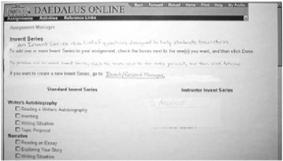
Figure 9.5:
The hand-written part is what we called a "magic sentence." These brief
explanations helped users understand the concepts and/or next step.
Note
These users were English teachers, and their willingness to read instructions online was
perhaps a bit greater than usual. But I have seen equally good results from changes of
similar scope—adding an example next to a field or reformatting a page to put the most-
needed information at the top.
Don't suboptimize the tasks.
Although your paper prototype is built around a particular set of
tasks you've created, don't forget about all the other tasks that users might be doing in real life.
Sometimes it's tempting to suboptimize the interface, in other words, tweak it so that users will get
through a specific task better. For example, users aren't seeing a menu option that falls below the
fold of the site, so you move it up. But to make a change like this, you also have to decide what
gets pushed
below
the fold. Take a step back and be sure this makes sense for the interface as a
whole. Otherwise you're only creating an illusion that you've solved the problem (as the cartoon in
Figure 9.6
illustrates), and the illusion will shatter as soon as the user does a different task.
Figure 9.6:
Make sure you're not just tweaking your interface to create the illusion that you've
solved a particular problem.
This chapter has discussed what the facilitator and Computer should do in a paper prototype usability
test. The ways that you set up the room, greet users, introduce the concept of paper prototyping, and
facilitate the session are all important. But don't forget that the main purpose of usability testing is to
provide data to other members of the team so that they can make the product better. The
next chapter
focuses on the observers.


Search WWH ::

Custom Search