Graphics Reference
In-Depth Information
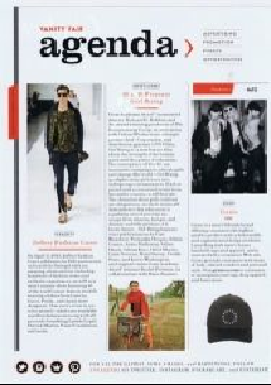
Figure 58. Proportional placement of colour.
The proportional placement of colour is often used in magazine layouts to draw attention
to specific elements. An example is the page layout from Vanity Fair magazine illustrated
in the following Figure. The strategic use of red sets up a hierarchy of elements within the
page and directs the viewer's attention to key areas around the page from the 'Vanity Fair'
at top left.
Figure 59. Proportional placement of colour.


