Database Reference
In-Depth Information
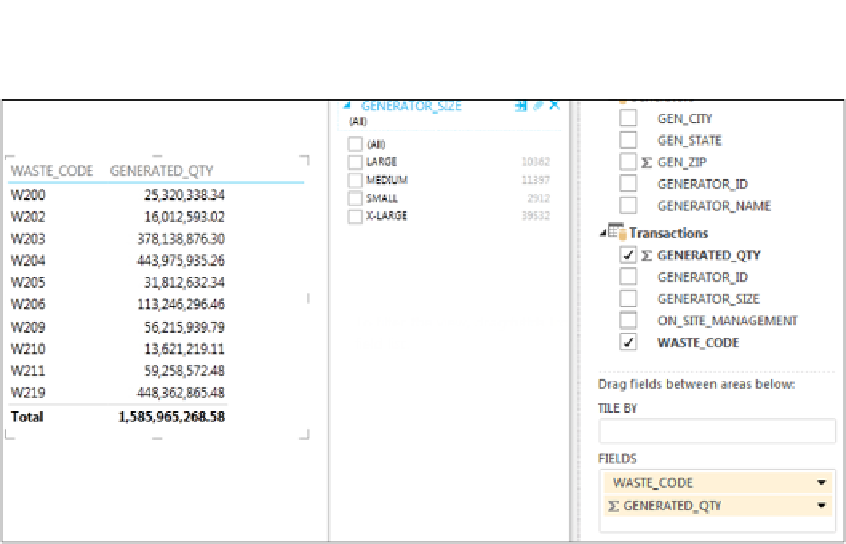
Figure 5-3:
Use the field list to drag data fields to the FIELDS drop zone, resulting in a table on the canvas.
Creating and working with Power View charts
All data in Power View starts off as a table, as shown in Figure 5-3. Again, dragging fields to the
FIELDS drop zone creates these tables. After you have a data table on the canvas, you can work with it
in several ways.
Transform data into a chart.
Click the data table and select a chart type from the Ribbon's Design
tab. Your choices are Stacked Bar, 100% Stacked Bar, and Clustered Bar.
Figure 5-4 shows the data converted to a Clustered Bar chart, with new drop zones appearing in the
field list. You use the new drop zones to configure the look and utility of the chart.
Sort, filter, or expand the chart to full screen.
When you click a Power View chart, a context menu
appears above the chart. With this menu, you can sort the chart series, filter the chart, and expand or
collapse the chart to full screen (see Figure 5-5).
Apply custom filters.
When you select a chart in the Power View canvas, the filter pane provides a
CHART option. You can click that link to see and apply custom filters to the selected chart. Figure 5-6
shows a chart filtered by the Generated_Qty field using a nifty slider.
Slice your chart series.
Drag a new data field into the LEGEND drop zone. In Figure 5-7, the On_Site_
Management field is placed in the LEGEND drop zone; as a result, the original chart is sliced by the
data items in the newly placed field.


Search WWH ::

Custom Search