Database Reference
In-Depth Information
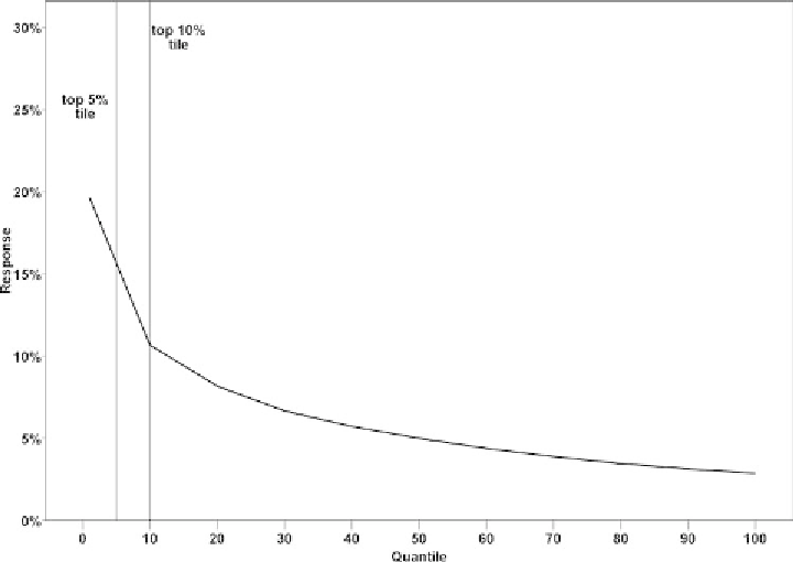
Figure 2.4
Response chart.
targeted lists and smaller error rates. Expanding the list to the right of the
X
-axis,
toward the bottommodel tiles, would increase the expected false positive error rate
by including in the targeting list more customers with no real intention to churn.
According to the gains chart (Figure 2.5), when scoring an unseen customer
list, data miners should expect to capture about 40% of all potential churners
if they target the customers of the top 10% model tile. Narrowing the list to
the top 5% tile decreases the percentage of potential churners to be reached to
approximately 25%. As we move to the right of the
X
-axis, the expected number of
total churners to be identified increases. At the same time, though, as we have seen
in the response chart, the respective error rate of false positives increases. On the
contrary, the left parts of the
X
-axis lead to smaller but more targeted campaigns.
The lift or index chart (Figure 2.6) directly compares the model's predictive
performance to the baseline model of random selection. The concentration of
churners is estimated to be four times higher than randomness among the top 10%
customers and about six times higher among the top 5% customers.
By studying these charts marketers can gain valuable insight into the model's
future predictive accuracy on new records. They can then decide on the size of the
Search WWH ::

Custom Search