Database Reference
In-Depth Information
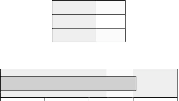
Model Summary
Algorithm
K-Means
5
Input Features
Clusters
6
Cluster Quality
Poor
Fair
Good
-1.0
-0.5
0.0
0.5
1.0
Silhouette measure of cohesion and separation
Figure 3.14
The overall silhouette measure of the clustering solution.
provides a useful visual examination of the clusters. The following figures show the
Cluster Viewer results for the mobile phone case study introduced in ''How Many
Components Are to Be Extracted?''.
Six clusters were derived after applying a K-means clustering algorithm to the
principal component scores. The cluster quality of the solution (Figure 3.14) is
good with an overall silhouette coefficient slightly greater than 0.5.
The next output of the Cluster Viewer is a cluster-by-inputs grid (Figure 3.15)
that summarizes the cluster centroids. The rows contain all the clustering fea-
tures/input fields, the five principal components, and the columns contain the
revealed clusters. The first row of the table illustrates the size of each cluster. The
table cells denote the cluster centers: the mean values of the component scores
over all members of each cluster.
At first sight the differentiating factors of each cluster are evident. Cluster 1
includes a relatively small number of ''superactive'' customers with increased usage
of all services. Cluster 2 customers are predominantly voice users. On the contrary,
cluster 3 mainly includes SMS users. Cluster 4 customers show increased roaming
usage while cluster 5 customers show increased usage of MMS and Internet
services. The customers in cluster 6 present the lowest usage of all services.
Cluster interpretation can be aided by additional Cluster Viewer graphs such
as the ones presented below. The graph in Figure 3.16 for instance compares
clusters 2 and 3 for the first two components, SMS and voice usage.
Search WWH ::

Custom Search