HTML and CSS Reference
In-Depth Information
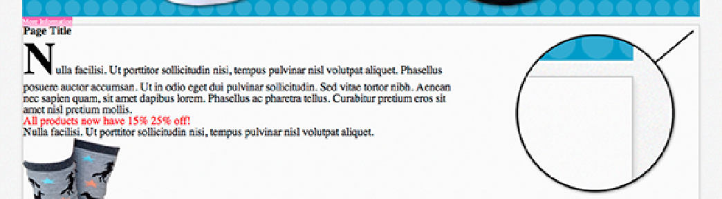
Figure 5-10
The main content area with a subtle box shadow.
The first four values of the
box-shadow
property can be any unit of length and modify the shadow as follows:
• The first value of a drop shadow represents its horizontal offset: how far the shadow is from the right of the
box, a negative value to its left. The shadow you added doesn't have an offset.
• The second value is the vertical offset. A positive number goes below the element and negative goes above.
The shadow you added is offset
3px
vertically from the main content element.
• The third value is the blur of the shadow. A value of
0
here would make the edges of the shadow sharp,
whereas
8px
gives it a mild blur.
• The fourth value is the spread distance, which determines how far the shadow should spread on all sides of
the element.
Following on from the shadow values is an optional color. By default, a shadow is black, but the shadow you added
has a light gray color to match the border.
You also are able to make box shadows inset so the shadow appears inside the element:
1.
In styles.css, find the rule set for
input[type=”text”], input[type=”email”]
and add the fol-
lowing:
box-shadow: -3px 3px 2px 0 #ccc inset;
2.
Save styles.css.
Adding this declaration gives the input fields of type
text
and
email
an inset shadow. An inset shadow is often a
good visual indication of an input field.
It's also possible to add more than one shadow to an element (see Figure 5-11), by separating shadows with a
comma:
box-shadow: 0 3px 8px 0 #ccc, 0 3px 8px 0 red inset;