HTML and CSS Reference
In-Depth Information
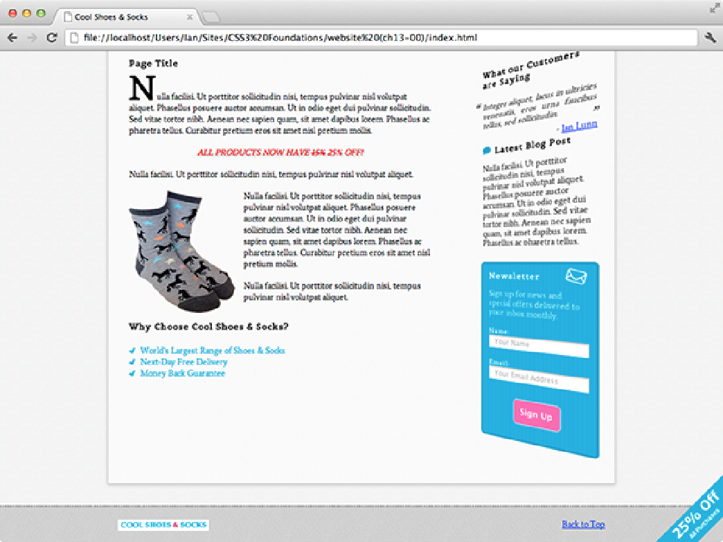
Figure 13-7
The Cool Shoes & Socks page zoomed out to show the sidebar rotated on the Y axis by -40 degrees.
Finally, using
rotateZ()
to rotate on the Z axis achieves the same effect as the
rotate()
function in a 2D
space. A positive angle rotates an element clockwise; and a negative angle, counterclockwise.
If rotating more than one axis, you may consider using the shorter
rotate3d()
function, which should be given
the X, Y, and Z values in that order.
scaleZ() and scale3d()
If you can translate and rotate in 3D, you won't be surprised to read you can scale, too. A quick recap:
scaleX()
scales an element horizontally, and
scaleY()
scales an element vertically. So what about
scaleZ()
?
scaleZ()
controls depth but, of course, not the depth of the element because an element doesn't have a thickness;
it can only be flat.
scaleZ()
works in conjunction with
translateZ()
to scale an element along the Z axis, af-
fecting its visual size (although not its actual dimensions) as if it were moved toward or away from the viewer.
At the moment, when the sidebar is hovered over, it's moved forward 100px by this declaration:
-webkit-transform: translateZ(100px);

