HTML and CSS Reference
In-Depth Information
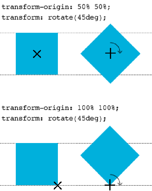
When you are transforming an element, that element has a transform origin, which, by default, is
50% 50%
(on both
the X and Y axes)—the center of the element.
As shown in Figure 12-7, the top element has the default origin of
50% 50%
, which places the origin in the center
(represented by a cross). When you apply a rotate transform of 45 degrees, that element is rotated around its origin.
Figure 12-7
An element being rotated 45 degrees around an origin of 50% 50% and 100% 100%.
In Figure 12-7, the element at the bottom has an origin that is placed 100% on the X axis and 100% on the Y axis
(the bottom-right corner). When you rotate the element 45 degrees around
this
origin, the transformation creates a
different effect.
Let's go back to the “25% Off” banner advertisement to make use of
transform-origin
.
Although the banner is in the desired position, as shown in Figure 12-8, when the text size is scaled in a browser
such as Firefox, the banner goes a bit crooked, and not all the text can be seen! This happens because the Y axis in
the
translate()
function is
-25px
, which is supposed to be half the height of the element. When text is resized,
the height of the element grows, and that
-25px
value may no longer be half the height of the banner, causing its
position to go off center.